November 13, 2005
A new look, part 2
While the changes to the front page sparked our look at a redesign, we changed much more than just our masthead. We also took a look at the mechanics of our readership and the content of our entire paper.
We looked to make our color pages more flexible for color ad usage (basically, the back pages of our sections), and we also wanted to rearrange much of our community news. Often the community-related news (social stuff like weddings, graduations, etc) jumped from the B section to the C section, and we definitely wanted to contain that to one section.
So we were changing the graphic look of the paper, but we were also tinkering with where pages went. We even had to make sure that the weekly crossword puzzle would go in a spot where crossword players could fold the paper and play the puzzle.
Graphically, most of our changes were the headers at the top of pages. First, we dropped almost all the color from the page headers to give our color photos more "pop." We didn't want anything competing graphically with the news we present, so everything is simple.
We didn't change the typeface of our headlines nor body copy. We changed our byline font, eliminated some dingbat-style ornamention, added a dateline on applicable stories, and standardized the look of various elements across sections. (Now all news briefs look the same, as do the headlines that identify frequent sections, such as sports announcements, and community events.) The new look facilitated a change in the name of some of our sections.
Another new feature is the addition of e-mail addresses in the page header. For instance, contact info for the community editor is at the top of the B1 section, the sports editor info at the top of the sports page, etc.
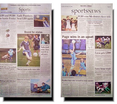
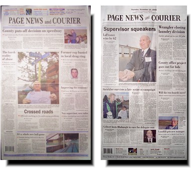
Below are some thumbnails of our section front pages. The old pages are on the left, with the redesigned pages from our last issue on the right. Unfortunately, we have font issues and I couldn't make electronic thumbnails. Instead I had to take photos of each section front, resulting in a poorer-quality image for viewers.
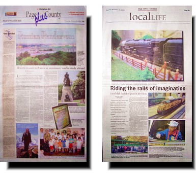
Our B section front changed the most, with the cultural events list moving to an inside page to give us a blank page to design with. We wanted to eliminate the busy look we'd had in the past and emphasize a clean, simple design with lots of white space. Three weeks into the new look, we've done that pretty well. I wrote and took the photos for the B1 package in the last issue (above, right), so I also did the layout for B1 and B2 in addition to sports.