November 10, 2005
A new look, part 1
More than a year ago, our newspaper began the process of a redesign. Finally, on Oct. 27, we unveiled our new look to our readers in conjunction with an open house to unveil our renovated offices. It took a lot of work for both events, and that's the main reason I've neglected my blog recently. Thankfully both changes met with a good response from our readers.
After more than 10 years without a real change to its graphic presentation, the paper was ready for a makeover.
Several things added to our desire to update the look. We'd recently had to add a barcode to the front page for vendor sales and we had an ungainly large white area at the top of the page where mailing addresses are printed for our subscribers. The mailing box had to be in the top right, and it unbalanced the look of our index and teasers, so we wanted a new look that didn't show that white box for single-copy sales.
Since we knew we were going to change the front page, we decided to unify the rest of the paper and improve organization for our readers (more on that later).
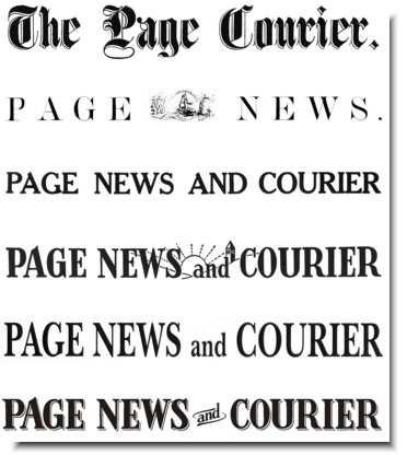
Our masthead (the newspaper "logo" on the top of the page) needed some work, too. From the 1950s to the 1970s, and maybe later, it was a decent, unique masthead. But when the paper started the shift to computers, that unique masthead transformed into a set of words in a computer font. There was nothing unique, and it had some typography problems.
Our goal was to create something unique again, and we wanted to evoke the look of older mastheads. The paper traces its lineage back to 1867, and we looked at past mastheads for ideas. The masthead from the 50s had some wonderful-looking characters, including the "A" with its ski slope, the "G" with its beard and inside ledge, and the "W" with its slight flare. We wanted those back.
We also had a decision to make. Do we keep the "and" in our name or change to an ampersand? Looking back through the past, we realized the word had always been spelled out, so we weren't about to overthrow a century of tradition. Graphically, though, we needed a solution for the little word.
Ultimately, the masthead carries much of the character of the 50s-era masthead, though we added some depth to recall the engraved look of the oldest masthead. Here's the progression (with the oldest on top to the new masthead on the bottom).
Details
I based the new look on the 50s-era masthead, but it was not any font that I could find. The unique characters I mentioned above weren't found anywhere. I could find similar things, but nothing identical. That meant I had to do everything "by hand" on computer.
I scanned in a copy of the 50s masthead, and used that image as my basis for recreating each letter in CorelDraw. Doing that allowed me to learn all the intricacies of each letter, and I found, for instance, that the "E" was not the same in each of its three uses. The "R" wasn't identical either. My conclusion is that the old masthead was from a custom typeface or hand-drawn.
When I finished recreating the letters, I could tell that there were some typography problems, aside from non-standard characters. Normally, a typeface has an interior "midpoint" called an x-height. Some typefaces have an x-height that is tall. Others go low, and some split the difference. My recreated masthead seemed to have three different x-heights. I wanted something standard.
![]()
I took the existing x-height of the "E" and tried adjusting everything to that, but the "A" was too compressed on top.
![]()
So I put the x-height for all the letters back where it started on the "A." That was even worse, especially on the "E" and the "R." The "P" was a little heavy-set too.
![]()
The final solution then was to go halfway. I looked for a middle ground, and found one that looked good across the board. Goldilocks would have been proud. First, it was too high. Then it was too low. Finally, it was juuuust right.
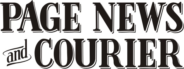
After skewing the "and" and adding some old-style ornamentation, I added depth to everything but the "and" by using two off-set copies of the masthead underneath. The middle copy was white, and the final combination helped the masthead reach another goal -- making it jump off the page.

The final step was to create what we called a "stacked" version for uses when the wide, one-row masthead wouldn't work, such as smaller house ads. We went from this ...
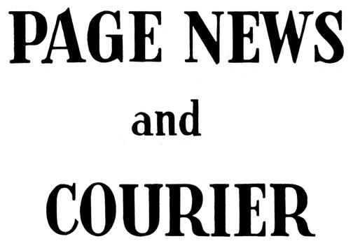
... to this.
There were intermediate versions as we worked on this, but all parties (up to the newspaper's owner) agreed on these final versions. In fact, I blogged at the time about the morning that my editor and I presented the new masthead to our owner and the board. It was also the morning I was prayed for as the grad in BJ chapel.
UPDATE: If you read this entry from the main page, you'll likely have some images that bleed over into the side column. I didn't even think about that when I posted. Since I'm too lazy to make them thumbnails and don't want to shrink them (so that you can see everything in all its glory), you'll need to click on the time stamp link below to get this entry on its own page. That will give you a chance to see all the images at the size I uploaded them.
Posted by JRC at November 10, 2005 03:51 PM | TrackBack