November 30, 2005
Highs and lows
First thing this morning I covered a successful water rescue. A woman had been missing all night and was found at first light. She and her car washed down a rain-swollen creek. It's not yet clear how long she'd been in the water when she was found.
When I arrived I couldn't really see into the car but I honestly thought it was going to be a body recovery from the silence of the scene and seeming lack of urgency. Rescuers reached the car, and I finally became aware of movement and realized it was a rescue.
I got some really good shots of the rescue (to be posted later), and went back to the office pretty excited.
That's when I got an e-mail from my editor saying that the victim of a stabbing that we reported in today's paper had died. He's giving me the story, which will be a tough thing to cover. The deceased was a football player I'd covered earlier in the month.
November 28, 2005
Viking offspring
My previous post continues a rash of similar black-and-white image postings on the blogs of a couple old society mates.
Micah was first to put such an image online, and he'll be the first, Lord-willing, to welcome a baby into the world.
Then came Austin, Il Filosofo, with news of his feto. By my calculation, we're a little farther along than Austin and Melita. But now that I've made my announcement, I can congratulate them on their news.
I know of at least one other former contemporary society friend blogging (and who will remain nameless), and I don't think we'll be seeing anything from him.
A Thanksgiving like no other (for us)
For the first time in two years, Darla and I made the trek to SC for Thanksgiving with both of our families. The festivities started on Wednesday night, when we announced to both sets of parents that May would bring our first baby! Our desire for a big celebration on the occasion of our fifth wedding anniversary has been decided: the baby's due date is one day before our anniversary.
We'd known for months that a baby was coming, and we wanted to tell the grandparents first, in person. We'd been dying to tell someone, so sharing our news was a great relief and an exciting time. On Thursday, we shared the news four times, with various groups of family. The Thanksgiving announcement came 27 years after my parents made a similar announcement at the family Thanksgiving banquet.
Already Darla has been to the doctor twice. Once was to get confirmation of the pregnancy. At that visit, she was surprised to get an ultrasound of the 8-week, 6-day baby. The ultrasound showed a strong heartbeat and moving arms and legs. Below is the more defined of two images she brought home. The baby's head is on the left of the image, with rather clear arms and legs just where they should be.
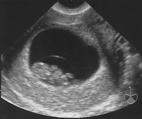
The second visit, at 11 weeks, allowed Darla to hear the baby's heartbeat, pumping away at 168 beats per minute.
This post may signal a change to my entries on this blog; as you can see, we've got a cute kid coming. We're excited!
November 22, 2005
Meeting of the minds
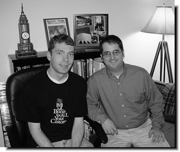
Shortly after I finished a photo shoot and an interview, de facto arrived on my doorstep amidst a hail of sirens. Actually the fire department was responding to its third call in 15 minutes when de facto rapped on the door to our apartment.
He's spending the night with us before the three of us head down to Greenville (in two cars) for the Thanksgiving holiday. It's been nice catching up with a friend, fellow publishing graduate, and fellow blogger.
November 13, 2005
A new look, part 2
While the changes to the front page sparked our look at a redesign, we changed much more than just our masthead. We also took a look at the mechanics of our readership and the content of our entire paper.
We looked to make our color pages more flexible for color ad usage (basically, the back pages of our sections), and we also wanted to rearrange much of our community news. Often the community-related news (social stuff like weddings, graduations, etc) jumped from the B section to the C section, and we definitely wanted to contain that to one section.
So we were changing the graphic look of the paper, but we were also tinkering with where pages went. We even had to make sure that the weekly crossword puzzle would go in a spot where crossword players could fold the paper and play the puzzle.
Graphically, most of our changes were the headers at the top of pages. First, we dropped almost all the color from the page headers to give our color photos more "pop." We didn't want anything competing graphically with the news we present, so everything is simple.
We didn't change the typeface of our headlines nor body copy. We changed our byline font, eliminated some dingbat-style ornamention, added a dateline on applicable stories, and standardized the look of various elements across sections. (Now all news briefs look the same, as do the headlines that identify frequent sections, such as sports announcements, and community events.) The new look facilitated a change in the name of some of our sections.
Another new feature is the addition of e-mail addresses in the page header. For instance, contact info for the community editor is at the top of the B1 section, the sports editor info at the top of the sports page, etc.
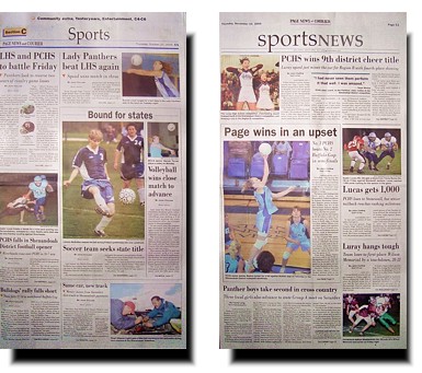
Below are some thumbnails of our section front pages. The old pages are on the left, with the redesigned pages from our last issue on the right. Unfortunately, we have font issues and I couldn't make electronic thumbnails. Instead I had to take photos of each section front, resulting in a poorer-quality image for viewers.
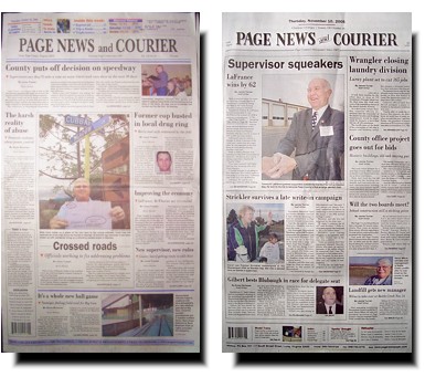
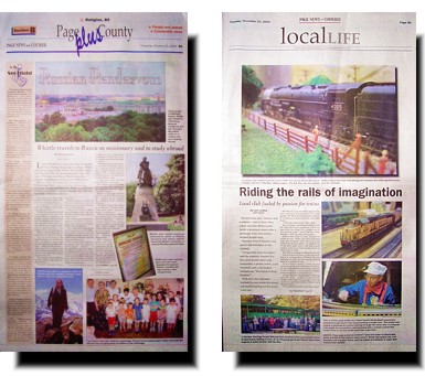
Our B section front changed the most, with the cultural events list moving to an inside page to give us a blank page to design with. We wanted to eliminate the busy look we'd had in the past and emphasize a clean, simple design with lots of white space. Three weeks into the new look, we've done that pretty well. I wrote and took the photos for the B1 package in the last issue (above, right), so I also did the layout for B1 and B2 in addition to sports.

November 10, 2005
A new look, part 1
More than a year ago, our newspaper began the process of a redesign. Finally, on Oct. 27, we unveiled our new look to our readers in conjunction with an open house to unveil our renovated offices. It took a lot of work for both events, and that's the main reason I've neglected my blog recently. Thankfully both changes met with a good response from our readers.
After more than 10 years without a real change to its graphic presentation, the paper was ready for a makeover.
Several things added to our desire to update the look. We'd recently had to add a barcode to the front page for vendor sales and we had an ungainly large white area at the top of the page where mailing addresses are printed for our subscribers. The mailing box had to be in the top right, and it unbalanced the look of our index and teasers, so we wanted a new look that didn't show that white box for single-copy sales.
Since we knew we were going to change the front page, we decided to unify the rest of the paper and improve organization for our readers (more on that later).
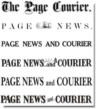
Our masthead (the newspaper "logo" on the top of the page) needed some work, too. From the 1950s to the 1970s, and maybe later, it was a decent, unique masthead. But when the paper started the shift to computers, that unique masthead transformed into a set of words in a computer font. There was nothing unique, and it had some typography problems.
Our goal was to create something unique again, and we wanted to evoke the look of older mastheads. The paper traces its lineage back to 1867, and we looked at past mastheads for ideas. The masthead from the 50s had some wonderful-looking characters, including the "A" with its ski slope, the "G" with its beard and inside ledge, and the "W" with its slight flare. We wanted those back.
We also had a decision to make. Do we keep the "and" in our name or change to an ampersand? Looking back through the past, we realized the word had always been spelled out, so we weren't about to overthrow a century of tradition. Graphically, though, we needed a solution for the little word.
Ultimately, the masthead carries much of the character of the 50s-era masthead, though we added some depth to recall the engraved look of the oldest masthead. Here's the progression (with the oldest on top to the new masthead on the bottom).
Details
I based the new look on the 50s-era masthead, but it was not any font that I could find. The unique characters I mentioned above weren't found anywhere. I could find similar things, but nothing identical. That meant I had to do everything "by hand" on computer.
I scanned in a copy of the 50s masthead, and used that image as my basis for recreating each letter in CorelDraw. Doing that allowed me to learn all the intricacies of each letter, and I found, for instance, that the "E" was not the same in each of its three uses. The "R" wasn't identical either. My conclusion is that the old masthead was from a custom typeface or hand-drawn.
When I finished recreating the letters, I could tell that there were some typography problems, aside from non-standard characters. Normally, a typeface has an interior "midpoint" called an x-height. Some typefaces have an x-height that is tall. Others go low, and some split the difference. My recreated masthead seemed to have three different x-heights. I wanted something standard.
![]()
I took the existing x-height of the "E" and tried adjusting everything to that, but the "A" was too compressed on top.
![]()
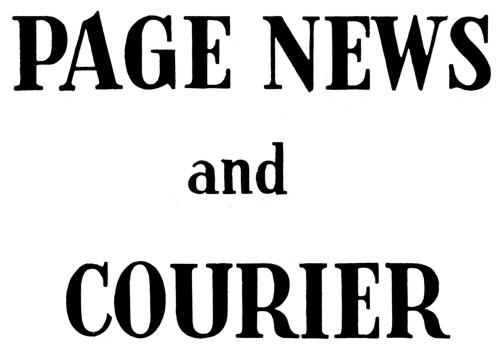
So I put the x-height for all the letters back where it started on the "A." That was even worse, especially on the "E" and the "R." The "P" was a little heavy-set too.
![]()
The final solution then was to go halfway. I looked for a middle ground, and found one that looked good across the board. Goldilocks would have been proud. First, it was too high. Then it was too low. Finally, it was juuuust right.
After skewing the "and" and adding some old-style ornamentation, I added depth to everything but the "and" by using two off-set copies of the masthead underneath. The middle copy was white, and the final combination helped the masthead reach another goal -- making it jump off the page.

The final step was to create what we called a "stacked" version for uses when the wide, one-row masthead wouldn't work, such as smaller house ads. We went from this ...
... to this.

There were intermediate versions as we worked on this, but all parties (up to the newspaper's owner) agreed on these final versions. In fact, I blogged at the time about the morning that my editor and I presented the new masthead to our owner and the board. It was also the morning I was prayed for as the grad in BJ chapel.
UPDATE: If you read this entry from the main page, you'll likely have some images that bleed over into the side column. I didn't even think about that when I posted. Since I'm too lazy to make them thumbnails and don't want to shrink them (so that you can see everything in all its glory), you'll need to click on the time stamp link below to get this entry on its own page. That will give you a chance to see all the images at the size I uploaded them.